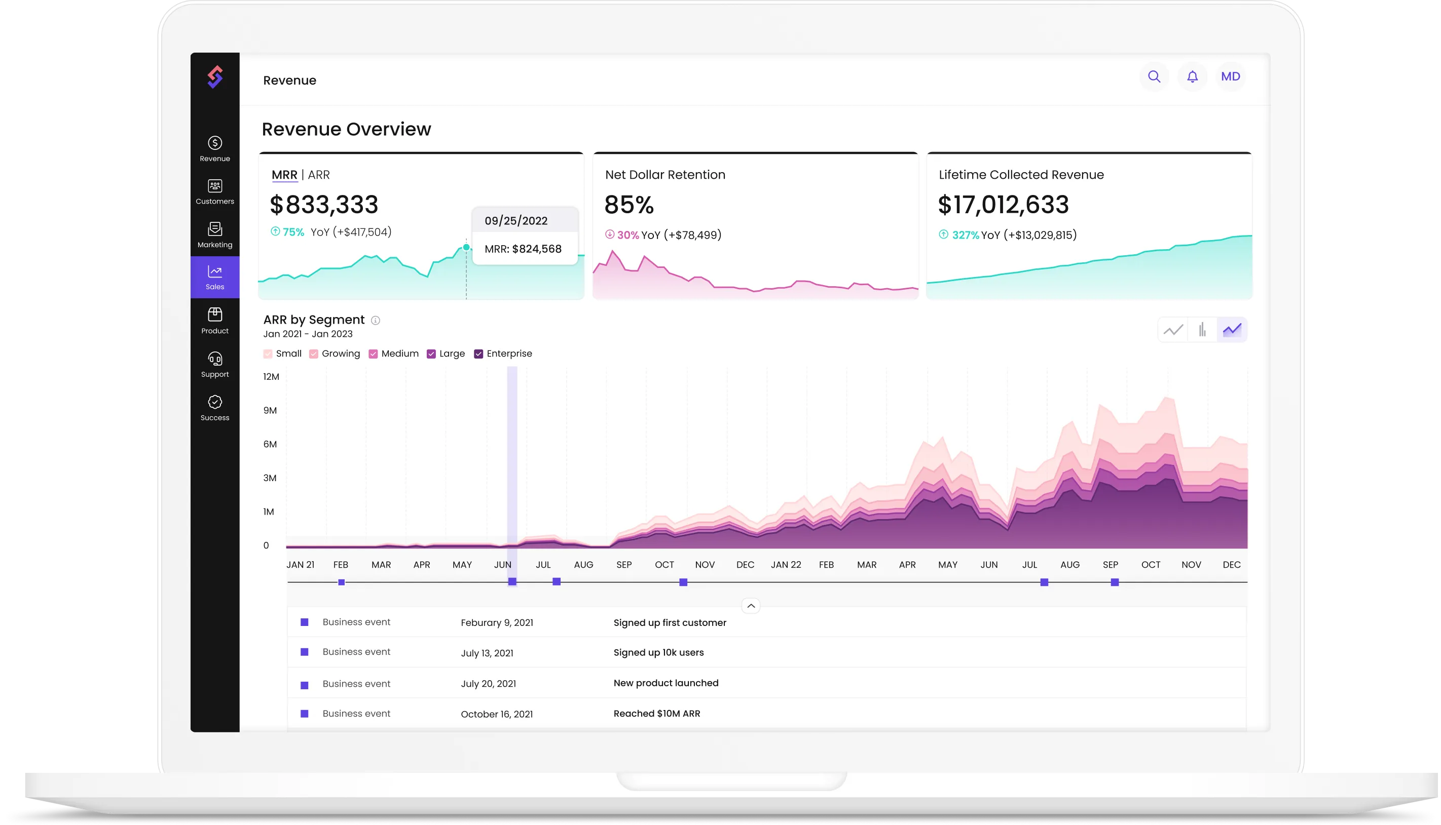
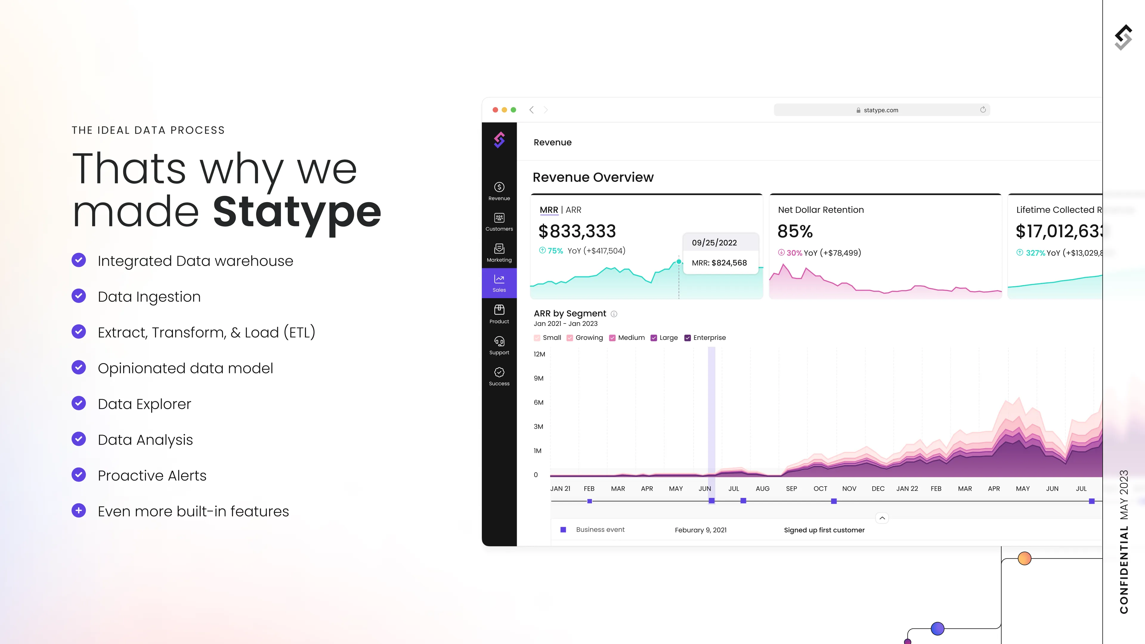
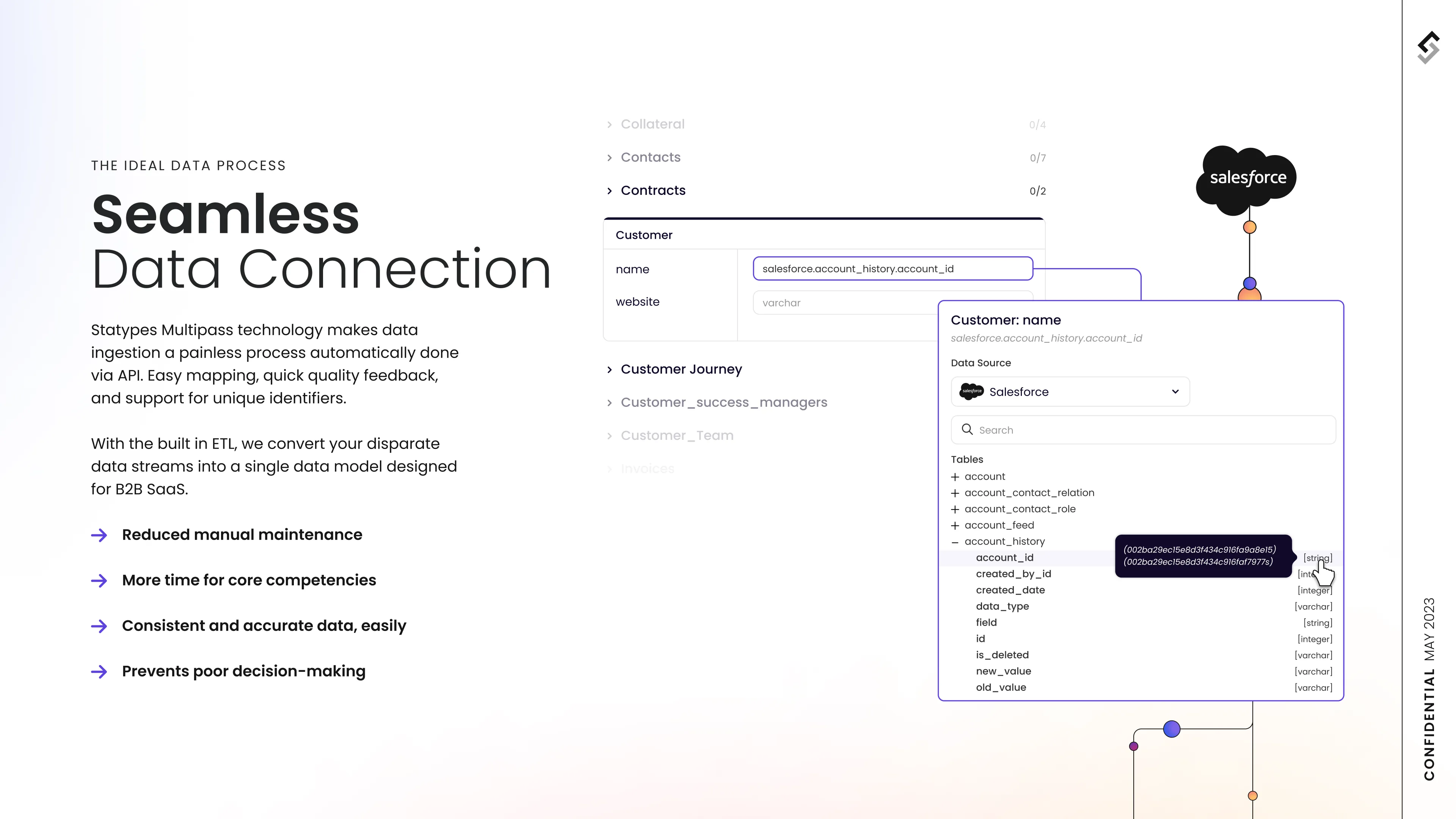
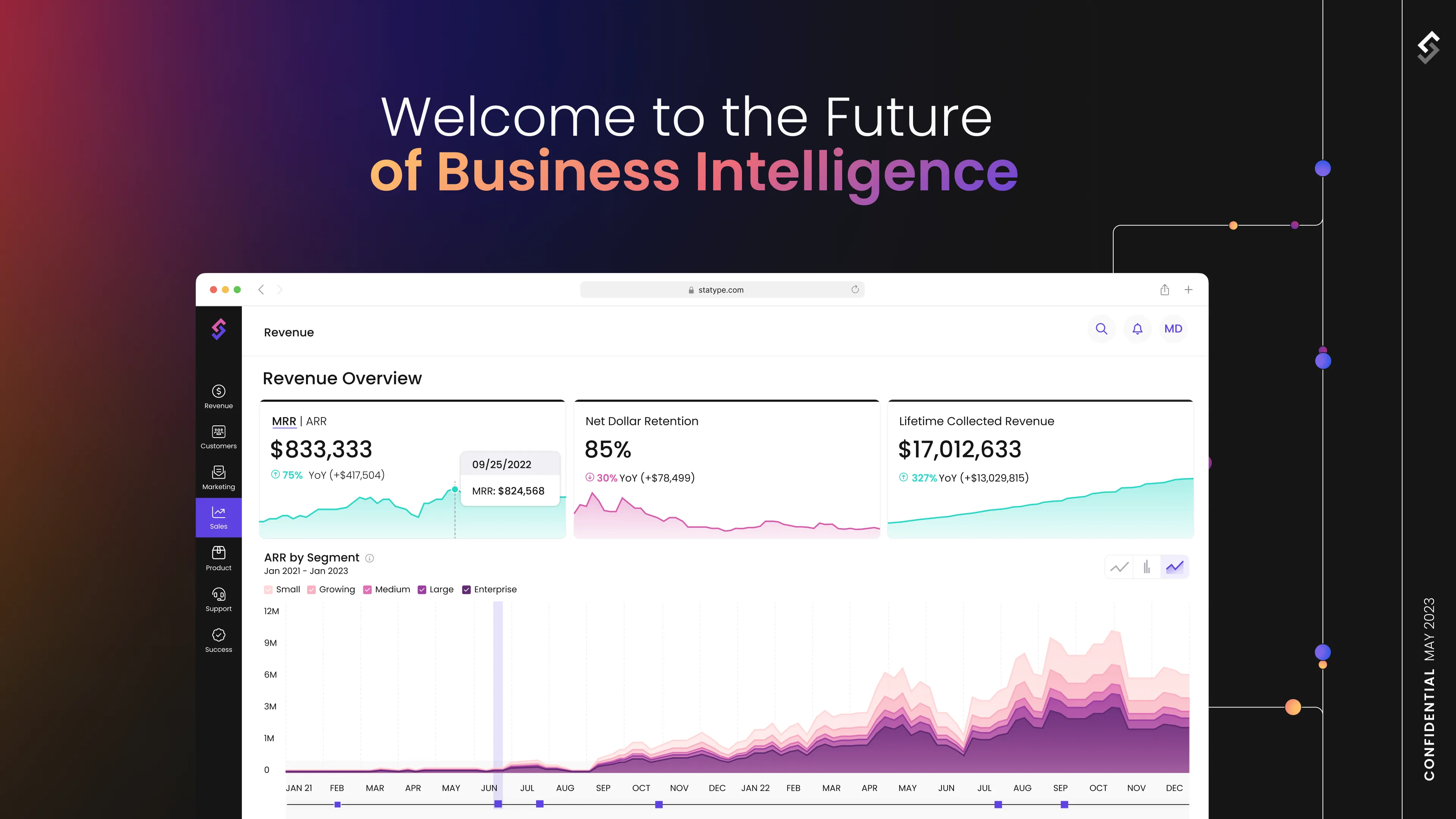
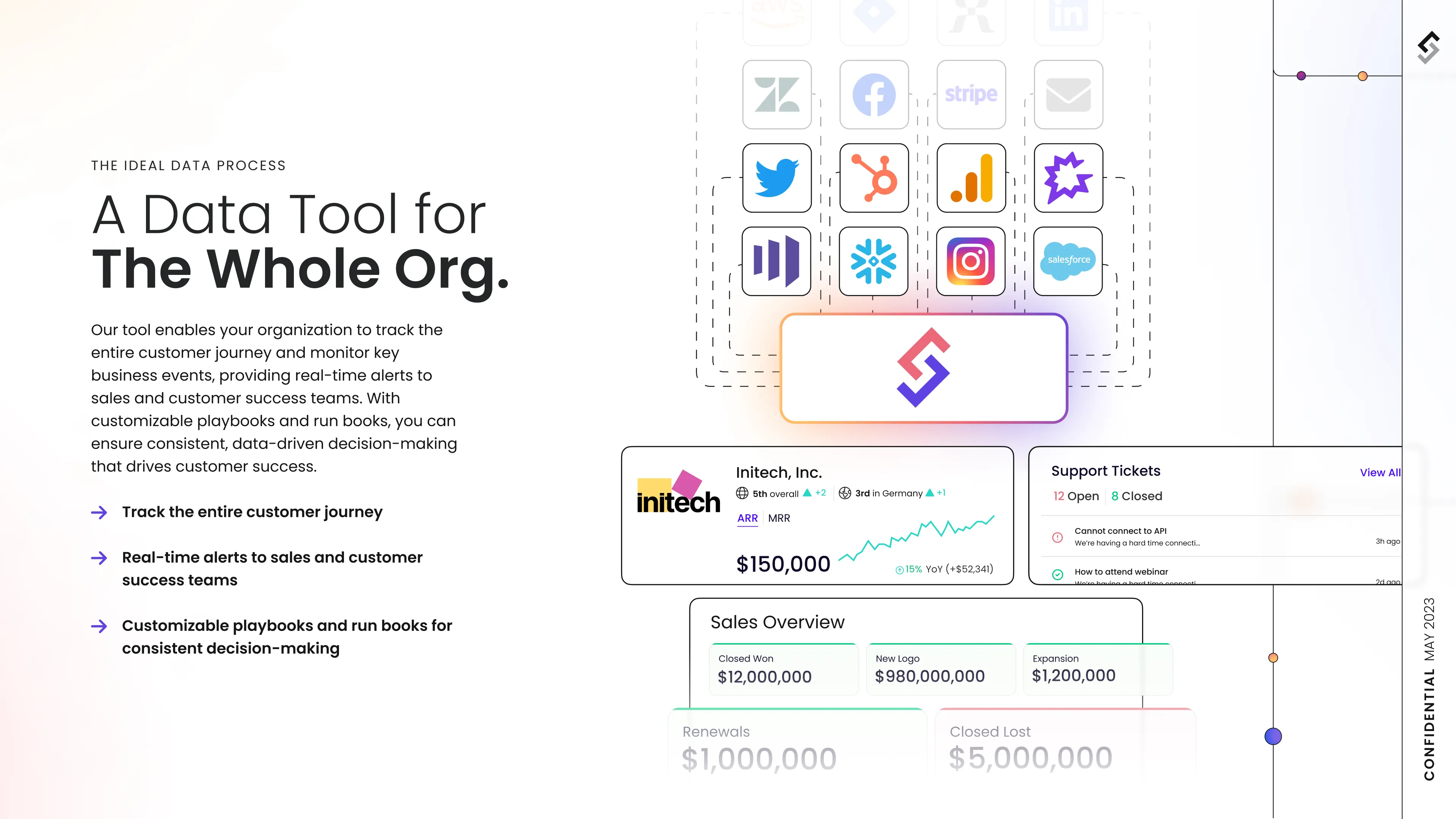
Statype revolutionizes business data analysis, enabling companies to effortlessly understand and utilize their data. This platform eliminates the need for complex coding or specialized reporting, providing businesses with a comprehensive view of their performance across various domains such as sales and customer interactions.
Statype faced a significant challenge: it lacked a memorable visual language and required a distinct design system. The existing system, focused on presenting complex data simply, needed a thorough accessibility audit.
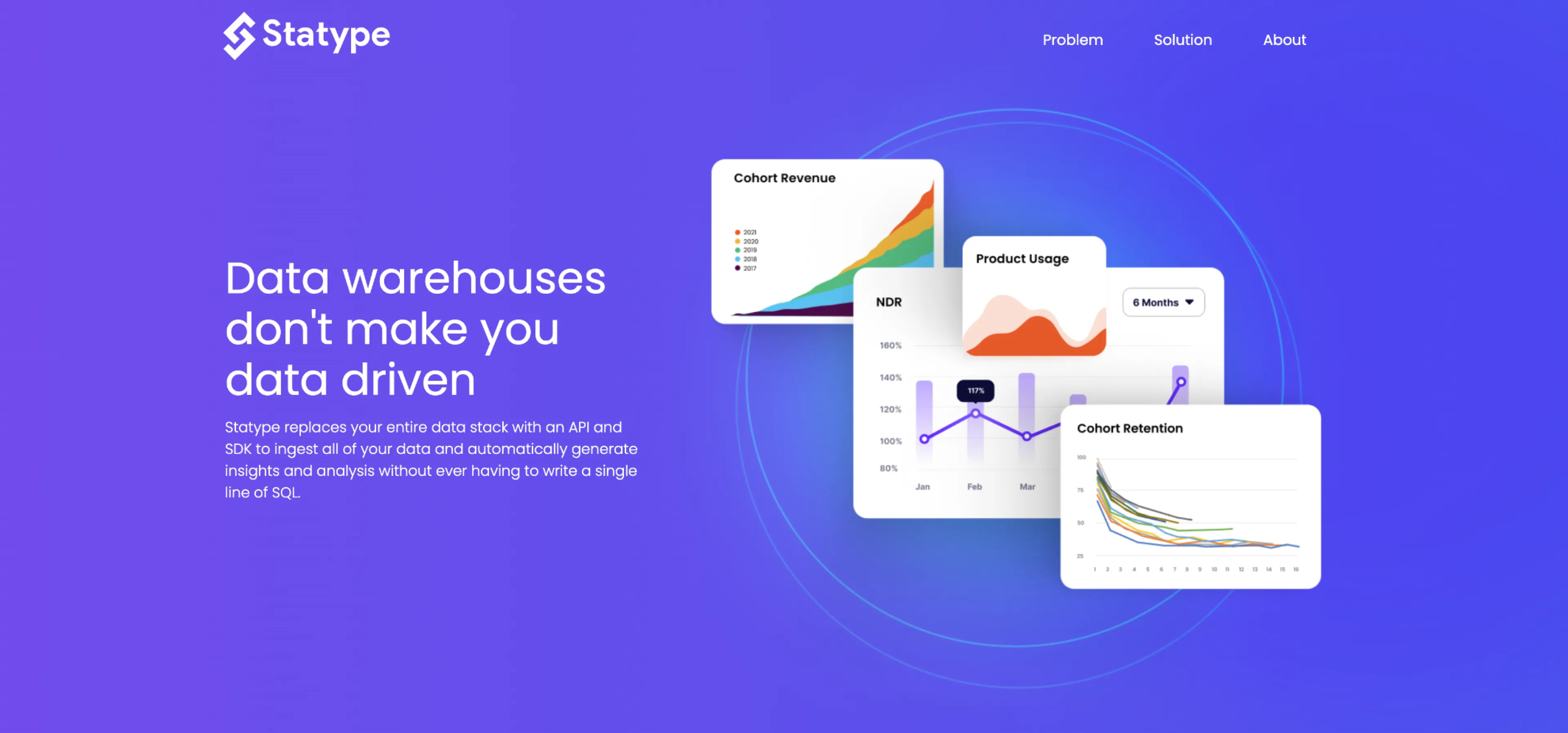
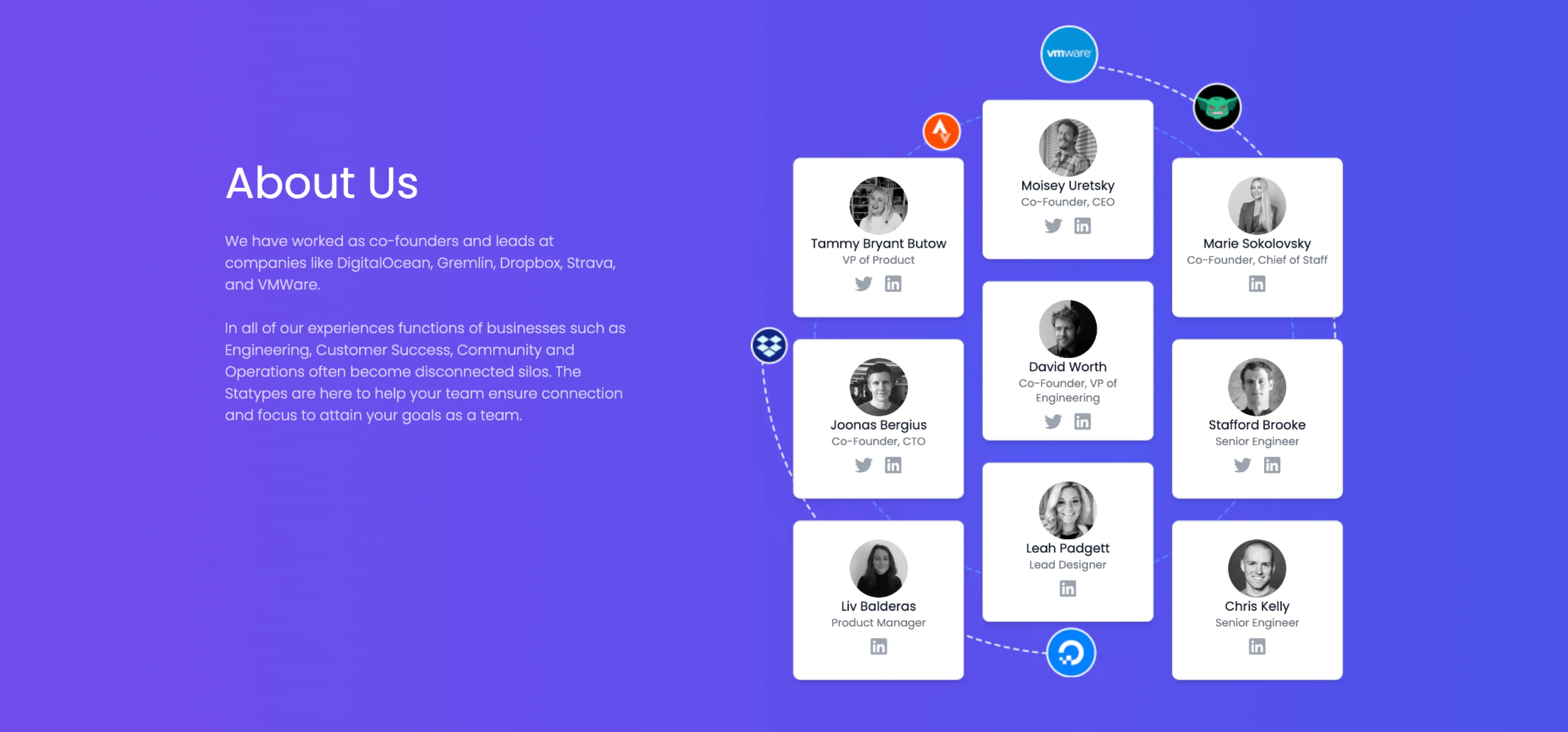
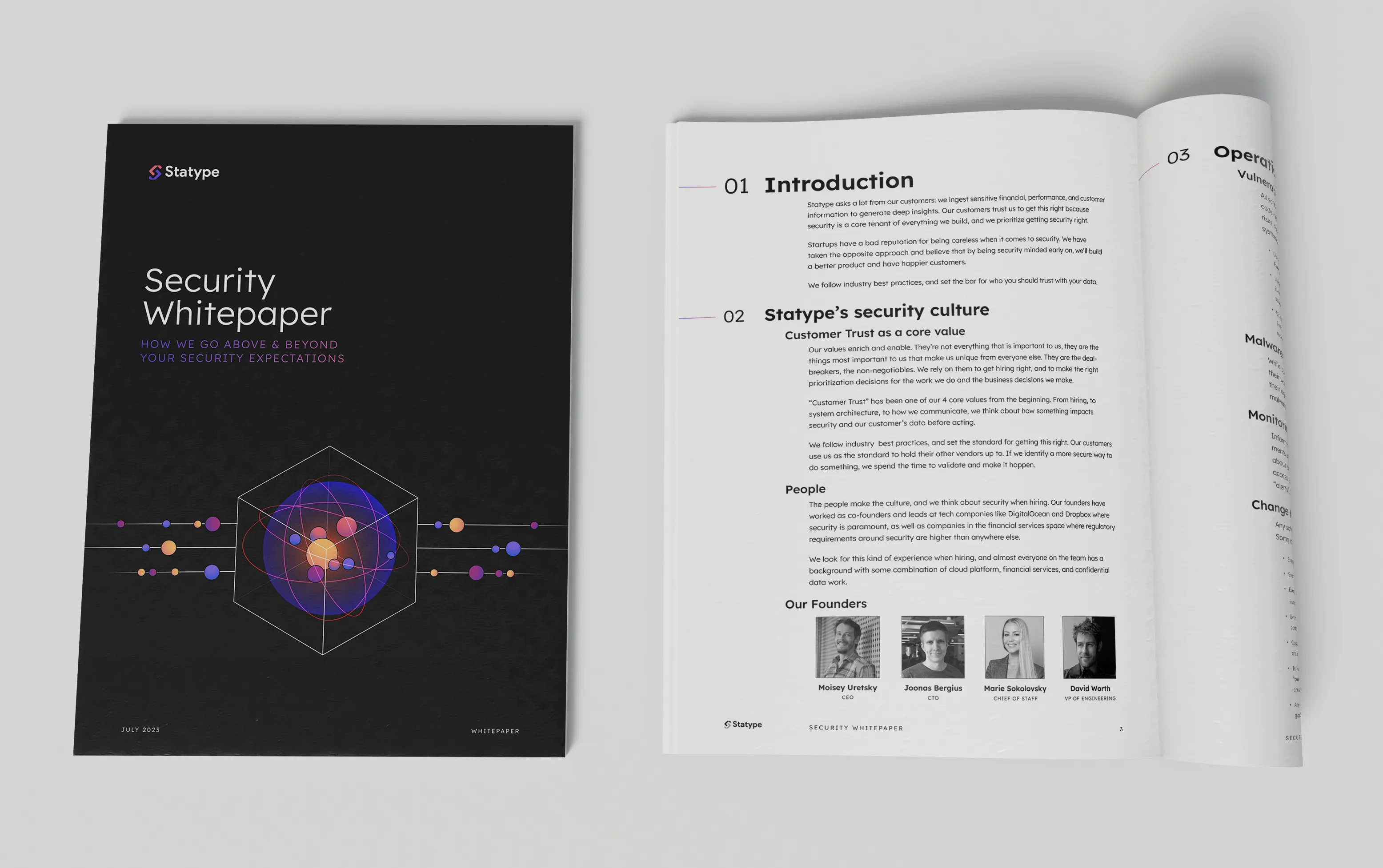
Aiming to bridge the marketing and product design, we developed a unified design system in collaboration with the Product and Dev teams. We began by revamping the color palette, ensuring compliance with WCAG standards and consistent lightness and contrast ratios. This palette was then seamlessly integrated into product graphs and marketing illustrations, unifying the visual language. We also refined the versatile weight range. Lastly we evolved the logo, creating a slimmer and more balanced mark that better represented the brand.
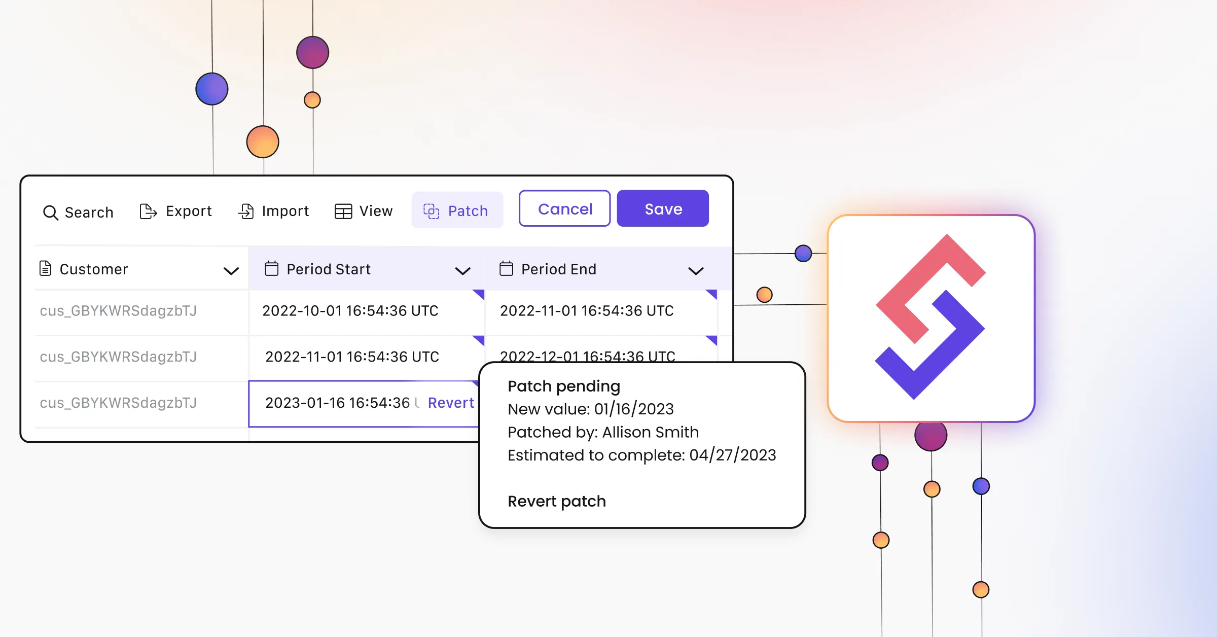
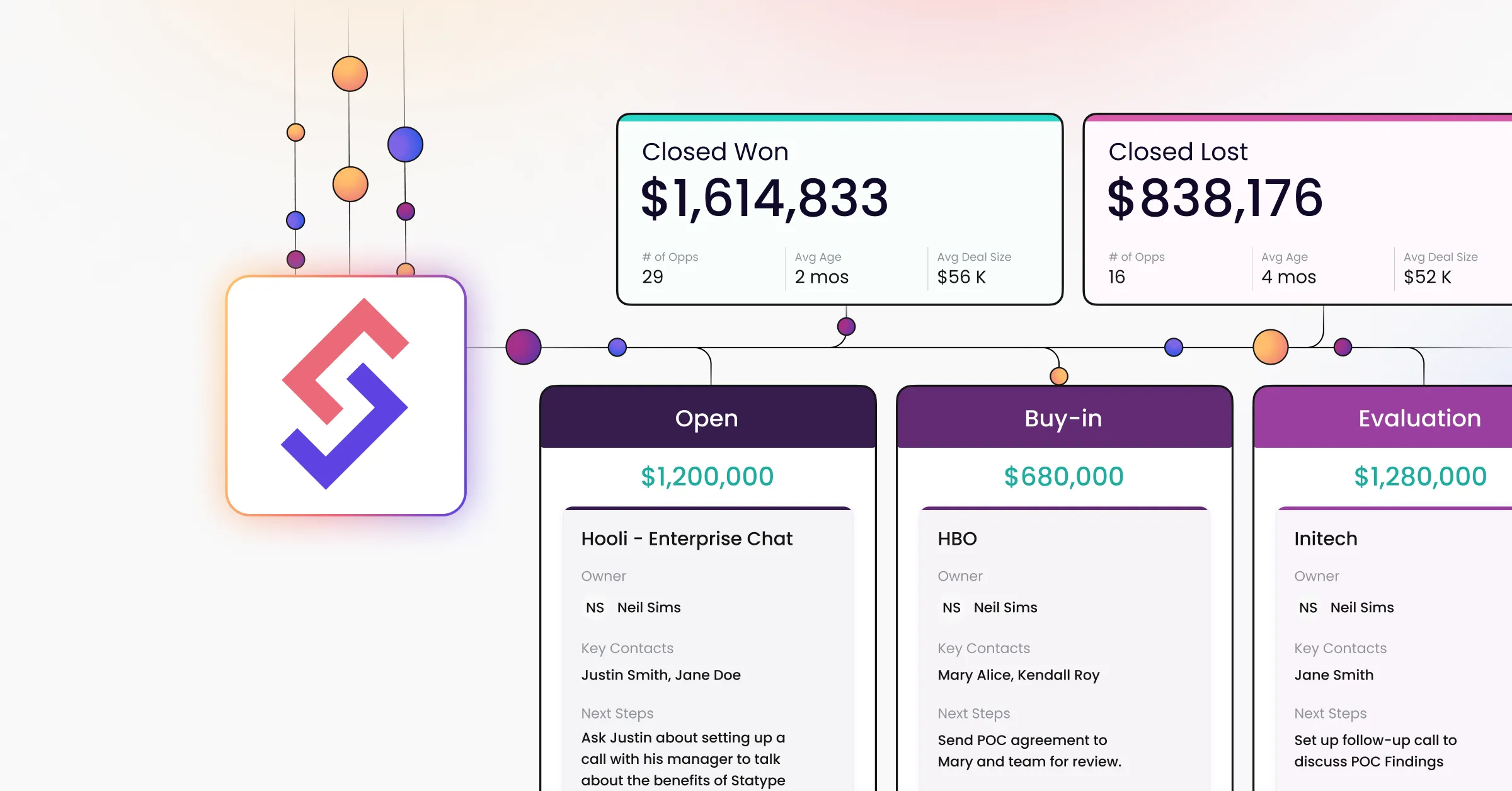
We built a core design system that branched into product and marketing-focused systems, enhancing efficiency and consistency. This system was integrated into the existing product and marketing website. Additionally, this project offered a chance to expand my frontend skills, as I worked with Astro, TailwindCSS, & TinaCMS, complementing the focused efforts of our development team on product features.
