Gremlin is a leader in digital reliability, offering innovative Chaos Engineering tools for large-scale systems. Their platform is essential in ensuring uninterrupted online services, with user-friendly testing methods that identify risks and foster continuous improvement.
Originally designed with SREs as the target audience, Gremlin's branding, featuring darker tones and mischievous gremlin mascots, resonated well and worked great to build brand recognition. However, as the target shifted to C-Suite executives, the branding, particularly the 'chaos' theme and mascot, became less appealing.

We worked with the team at Studio Science to develop a sound brand
strategy and build an updated visual identity. We worked to keep
several existing elements including the base word mark to keep the
brand recognition Gremlin had worked so hard to build.
Focusing on the identified Sage persona, we adjusted the visual
language to provide a sense of wisdom and reassurance. This was especially
important in a product based on causing errors in order to provide a better
end user experience.
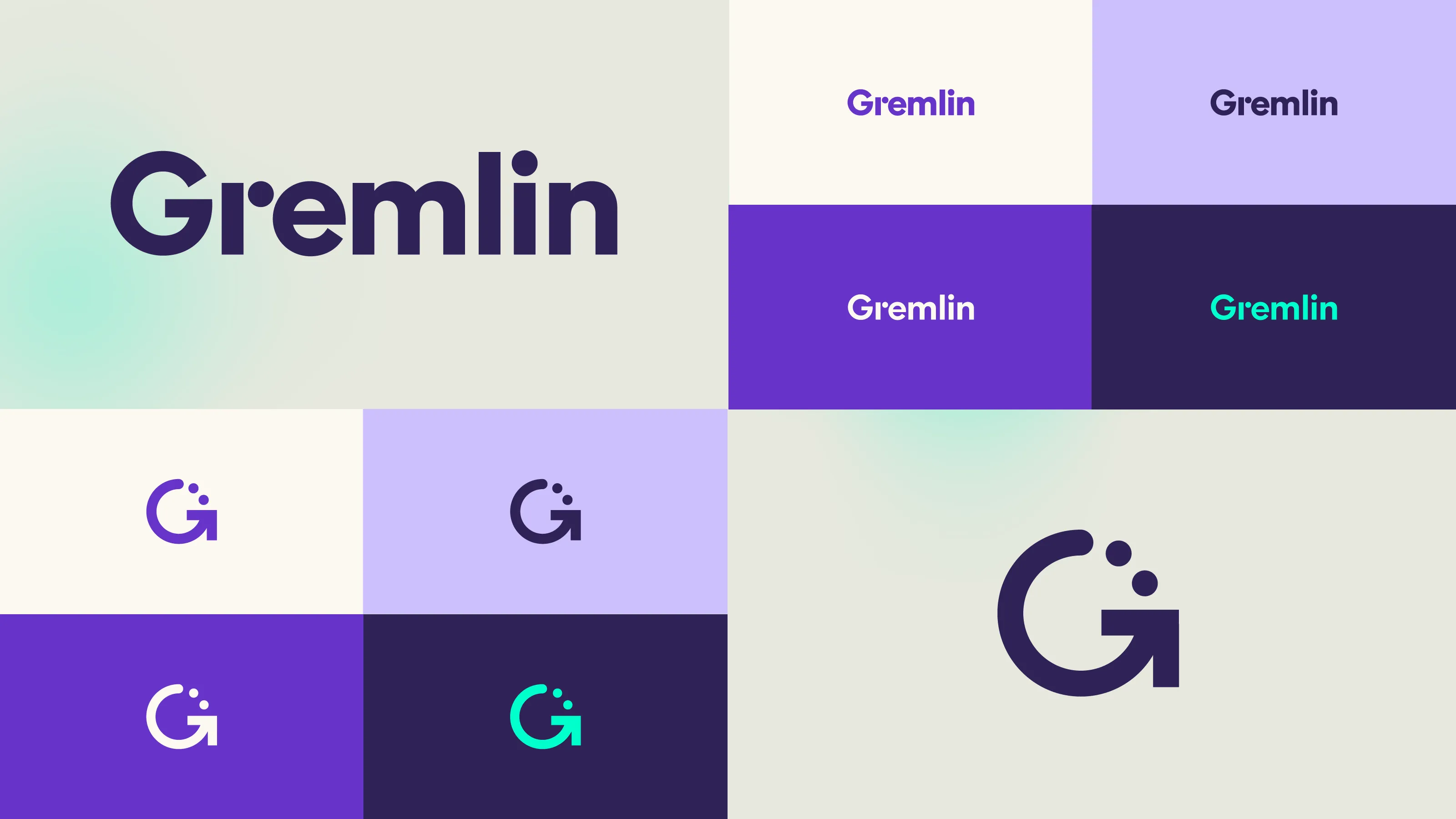
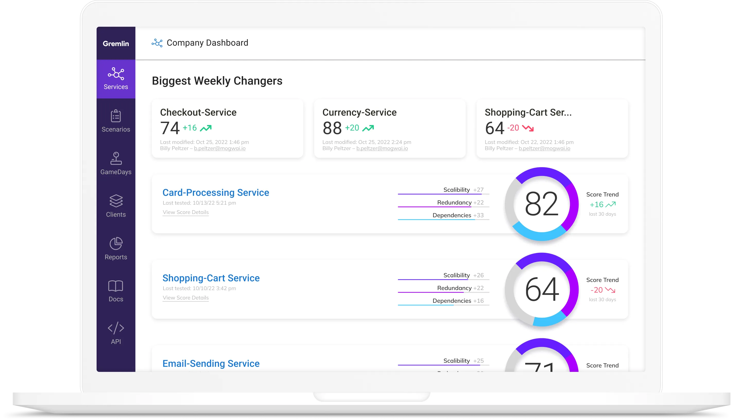
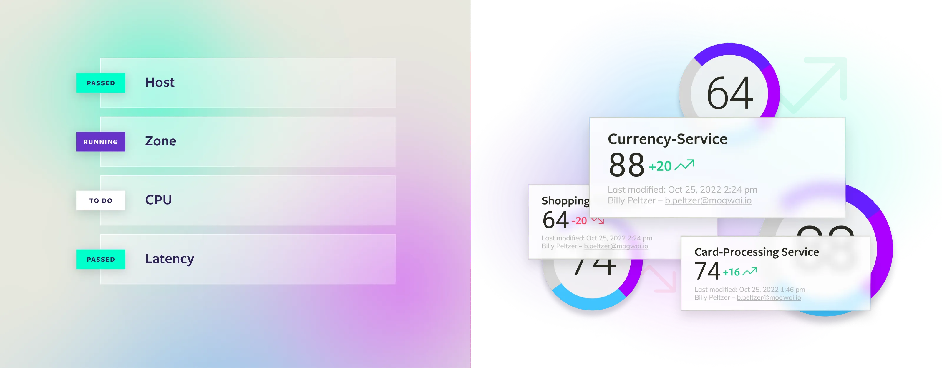
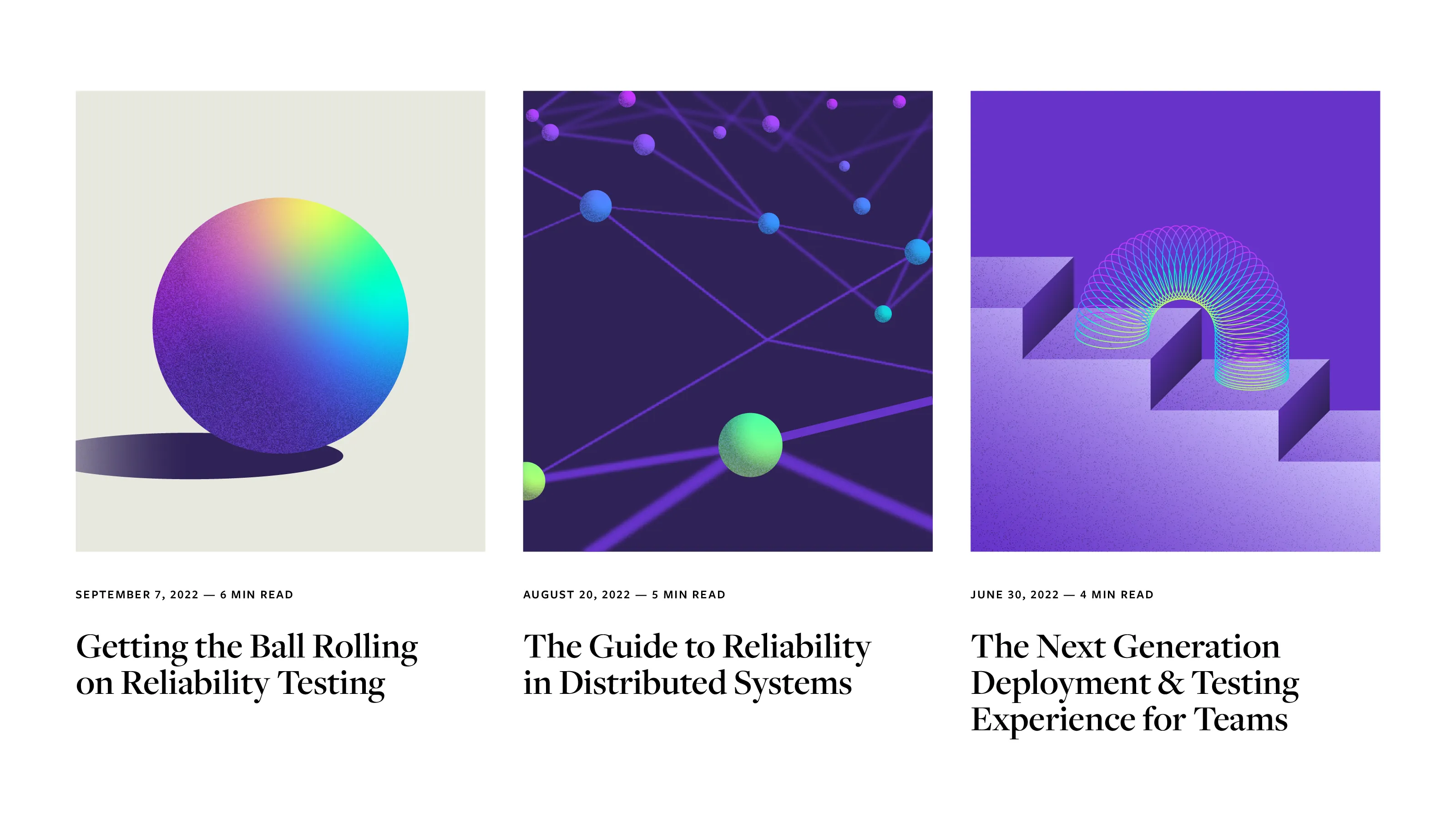
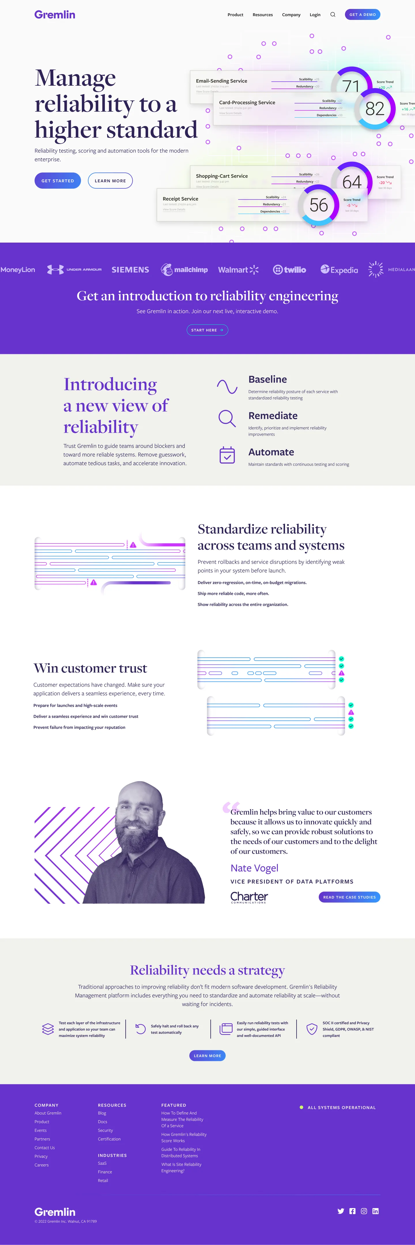
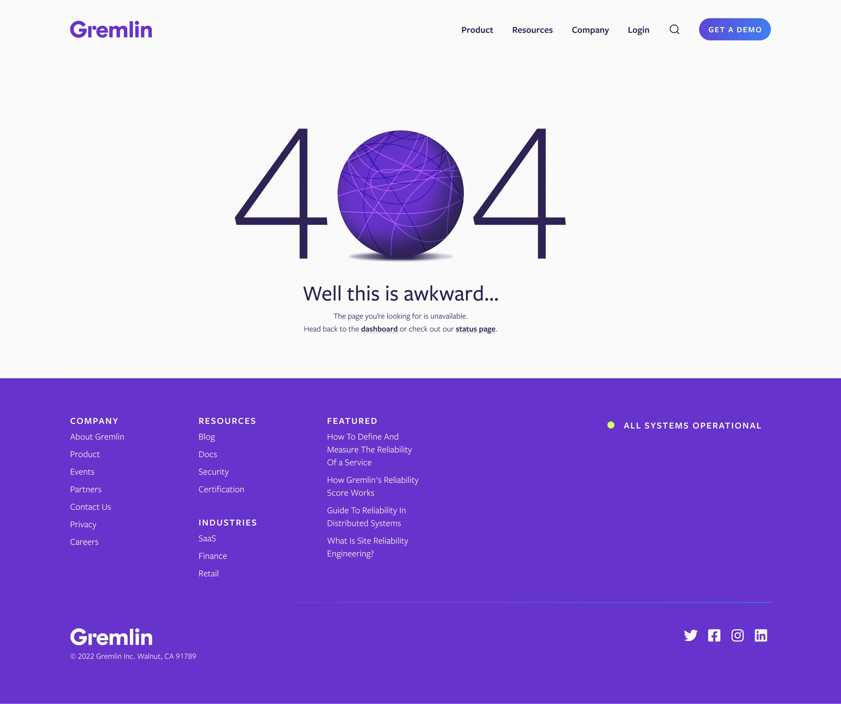
This significant visual overhaul aimed to preserve brand recognition while updating the core persona and identity. We revamped all brand touch points, including pitch decks, sales materials, event booths, the website, and product interfaces. The design system update facilitated a smooth transition across all areas, allowing for detail-focused launches.
